A Answers

A.1 Starting R and finding your way around

Answer of 1.1. 

 
> ??multivariate anova 
stats::manova           Multivariate Analysis of Variance 
stats::summary.manova   Summary Method for Multivariate 
                        Analysis of Variance  

So, manova() should be the function we are looking for. Now it’s time to type ?manova and learn how to use it. Note that part of the output is trimmed for readability.

Answer of 1.2. 

The answer may change depending on the version of R and the packages loaded in the R environment. On my system if I press tab after the third letter (the initial segment sha) the full function name is displayed. And, after sh pressing tab twice gives me a list of 9 commands.

Answer of 1.3. 

Here is a way to do it:

 
1> x = 20 
2> m = 10 
3> 5 = s 
4> t <- x - m 
5> t / s -> z 
6> z 
7[1] 2  
8

Note the different assignment operators, <- and ->, in lines 4 and 5. We have already mentioned <-. -> is similar, but you place the target variable to the right of ->, which is sometime handy when you start writing a complex expression and what to store the result in a variable.

Answer of 1.4. 

 
z = (x - m) / s  

Thing to note is that you need parentheses around the subtraction operation for correct interpretation. What is the result without parentheses?

Answer of 1.5. 

First we search using the keyword ‘logarithm’

 
> ??logarithm 
base::log      Logarithms and Exponentials 
nlme::logDet   Extract the Logarithm of the Determinant  

Some additional information is excluded from this listing. In this case R finds two matches. We are interested in the first one. The notation base::log tels that there is a log function in package base. We will study use of packages later. It is reassuring that it is in base package. Which means it is directly accessible.

Now we know the function name, we calculate the logarithm of 2.7:

 
> log(2.7) 
[1] 0.9932518  

Answer of 1.6. 

If you have tried help(log) or ?log (or ?base::log), you see that you can give a second parameter as base of the logarithm. Furthermore, R gives you ‘shortcut’ functions for common bases like, log2() and log10(). We will use the first method:

 
> log(2.7, base=2) 
[1] 1.432959  

We could just type log(2.7, 2), since the value is the first and base is the second argument. The notation we use specifies the base parameter explicitly, so that you do not need to remember the order of the parameters. This notation is particularly useful for well known parameters (like mean or sd) of other commonly used functions as well.

Answer of 1.7. 

 
> ls() 
[1] "m"  "s" "t"  "x"  "z" 
> rm(t,x) 
> ls() 
[1] "m"  "s" "z"  

Here is a tip for deleting all variables without needing to list all files (use with caution!):

 
> rm(list=ls()) 
> ls() 
character(0)  

Answer of 1.8. 

 
> sd(nwords)/sqrt(length(nwords)) 
[1] 7.485096  

The sqrt(x) function we used here is an alternative to x̂0.5.

Answer of 1.9. 

1> znwords <- (nwords - mean(nwords)) /sd(nwords) 
2> znwords; mean(znwords); sd(znwords) 
3[1] -0.06759625 -0.15209156 -1.84199776 0.35488030 
4[5]  0.18588968  0.56611858 -0.27883452 0.31263265 
5[9]  1.96029119 -1.03929231 
6[1] 3.852463e-15 
7[1] 1

On line 2, we specified multiple commands on a single line, separating them with semicolons ‘;’. You could, of course, run each command on a separate line.

Note that R displays the mean on line 6 using the scientific notation. This means 3.86 × 10¹⁵, a very small number (but should it not be 0?).

Answer of 1.10. 

 
> sort(c(36,35,8,71), decreasing=T) 
[1] 71 36 35  8  

Another side note here: T is a shorthand for TRUE. It is unlikely to make a difference for most purposes, but TRUE is a language reserved keyword, and T is just a convenience variable. If you are interested, the following proves the point:

 
> T 
[1] TRUE 
> T = FALSE 
> T 
[1] FALSE 
> TRUE = FALSE 
Error in TRUE = FALSE : 
        invalid (do_set) left-hand side to assignment  

If you try these, do not forget to rm(T) at the end of your trial. Otherwise, at some point later, you may have a hard time understanding ‘why things stopped working as they used to be’.

Answer of 1.11. 

 
> seats = c(36,35,8,71) 
> (seats / sum(seats))  100 
[1] 24.000000 23.333333  5.333333 47.333333 
> round((sort(seats, dec=T) / sum(seats))  100, 2) 
[1] 47.33 24.00 23.33  5.33  

Line 3 gives the answer, but line 4 uses the sorted list and rounds the result to two significant digits after dot, which makes it easier to read.

Answer of 1.12. 

 
> wdiff <- c(6,8,6,5,7,5,9,7,10,9)  

Answer of 1.13. 

 
> nwords2 = nwords 
> nwords = nwords - wdiff 
> nwords; nwords2 
 [1] 3497 3495 3456 3506 3503 3515 3486 3504 3541 3469 
 [1] 3510 3508 3468 3520 3516 3525 3505 3519 3558 3487  

Note, again, the use of multiple commands on the same line. This time it is particularly useful, since it allows easier comparisons of the (short) vectors.

Answer of 1.14. 

 
> mean(wdiff) 
[1] 7.2 
> mean(nwords2) - mean(nwords) 
[1] 7.2  

A.2 Basic data exploration and inference

Answer of 2.1. 

 
> stem(words) 
  The decimal point is 4 digit(s) to the right of the | 
 
  0 | 255666 
  1 | 0113445778 
  2 | 011 
  3 | 2  

The value displayed on the last line (corresponding to the person who spoke 31955 words) seem to be quite far away from the others.

Answer of 2.2. 

 
> hist(words)  

you should see the histogram on a separate window. For now, we will only display our graphs on screen without much makeup. R allows you to control every aspect of your graphs, and you can save graphs from R in many different formats. We will frequently revisit graphs later in this tutorial.

Answer of 2.3. 

 
> boxplot(words)  

Answer of 2.4. 

 
> boxplot(words.f, words.m)  

Answer of 2.5. 

 
> cor(words, age) 
[1] -0.2604937  

We have a negative correlation, indicating people speak less with age. The correlation is not strong, you should interpret the strength of the correlation with respect to the problem at hand, but typically absolute values less than 0.5 would not be regarded as a strong correlation.

Answer of 2.6. 

 
> cor(words.m, words.f) 
[1] -0.3212523  

There is no reason for these two values to be correlated (unless sampling is done horribly wrong, and order of the numbers reflect it somehow). Best explanation for the above correlation coefficient is ‘chance’. And we will be discussing inference for correlation later.

Answer of 2.7. 

 
> plot(age, words)  

The convention is to put the predictor on the x-axis and the response variable on the y-axis. Presumably, we are interested in effect of age on talkativeness (unless you hypothesize that talking keeps you young). We should put age on the x-axis and words on the y-axis.

Answer of 2.8.  Here is the result, including the scatter plot:

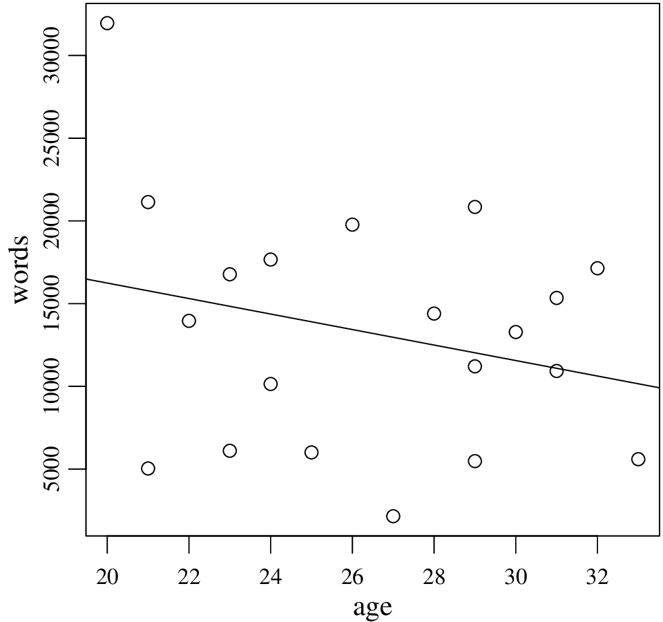
The regression line indeed agrees, it indicates that as age increases, people become less talkative. In fact, the correlation coefficient, Pearson’s r, is simply normalized simple regression slope. However, as we will stress later, least squares regression (and also correlation) is sensitive to extreme values. In our example, it seems the regression line is affected (possibly substantially) by the youngest and most talkative participant.

You may want to remove this data point (or replace with a more moderate value) and try last three exercises again. You are encoraged to exercise with removing or replacing data points as you like here. However, when you remove data points in ‘real’ research, you should be convinced (and be ready to convince others) that it is a sensible thing to do.

Answer of 2.9. 

 
> plot(words.m, words.f) 
abline(lm(words.f ~ words.m))  

Answer of 2.10. 

 
> se.words <- sd(words)/sqrt(length(words)) 
> se.words 
[1] 1620.478  

Answer of 2.11. 

 
> mean(words) - 2  se.words 
[1] 10007.14 
> mean(words) + 2  se.words 
[1] 16489.06  

or a more practical notation:

 
> mean(words) - c(-2, 2)  se.words 
[1] 16489.06 10007.14  

The second calculation may be difficult to grasp at this point. However, it shows clearly how R treats the vectors.

Answer of 2.12. 

 
> mean(words) + qnorm(0.025)  se.words 
[1] 10072.02 
> mean(words) + qnorm(0.975)  se.words 
[1] 16424.18  

Or simplifying it similar to the above, both for normal and t distributions:

 
> mean(words) + qnorm(c(0.025,0.975))  se.words 
[1] 10072.02 16424.18 
> mean(words) + qt(c(0.025,0.975), df=19)  se.words 
[1]  9856.401 16639.799  

The confidence interval calculated using the t distribution is larger (less certain, or more conservative if testing for hypotheses). As expected, ‘multiply by ± 2’ approximation yields a slightly larger interval than the intervals calculated using the normal distribution.

Answer of 2.13.  The confidence intervals calculated in Exercise 2.12 includes 16000. As a result, we cannot reject the null hypothesis (that there is no statistically significant difference).

Answer of 2.14. 

 
> t.test(words, mu=16000) 
        One Sample t-test 
data:  words 
t = -1.6982, df = 19, p-value = 0.1058 
alternative hypothesis: true mean is not equal to 16000 
95 percent confidence interval: 
  9856.401 16639.799 
sample estimates: 
mean of x 
  13248.1  

Not surprisingly, the difference is not significant at 0.05 significance level (p-value = 0.1058). Also note that the confidence interval reported by t.test() is the same as the confidence interval you calculated using the t distribution above.

Answer of 2.15.  Again, we simply do a single-sample t test.

 
> t.test(words.f, mu=20000) 
        One Sample t-test 
data:  words.f 
t = -4.2857, df = 9, p-value = 0.002033 
alternative hypothesis: true mean is not equal to 20000 
95 percent confidence interval: 
  9590.798 16783.202 
sample estimates: 
mean of x 
    13187  

This time we have a small p-value. So we can reject the hypothesis that population mean is 20000.

Answer of 2.16.  We can already tell by looking at the mean values (in our sample, mean value for men is larger than that of women). However, we do the test nevertheless:

 
> t.test(words.f, words.m, alternative=greater) 
        Welch Two Sample t-test 
data:  words.f and words.m 
t = -0.0367, df = 13.889, p-value = 0.5144 
alternative hypothesis: true difference in means 
            is greater than 0 
95 percent confidence interval: 
 -5990.058       Inf 
sample estimates: 
mean of x mean of y 
  13187.0   13309.2  

The above tests whether we can reject the null hypothesis, μf μm 0 in the population. Since p-value is (much) greater than 0.05, we can not reject the null hypothesis and can not conclude that ‘women talk more’.

Two notes on the above output: First, the confidence interval reported is for the difference of means (as expected it includes 0). Second, R reports that this is a ‘Welch Two Sample t-test’ instead of calling the test simply ‘independent samples t-test’. This is due to the fact that t.test() function by default applies a correction for unequal variances. You can force t.test() to assume equal variances (see help(t.test)).

A.3 Linear regression: a first introduction

Answer of 3.1. 

 
> plot(mot~chi, data=mlu)  

or, alternatively

 
> plot(mlu$chi, mlu$mot)  

Answer of 3.2.  No answer yet.

Answer of 3.3.  Assuming you have decided the best line is with intercept 5.5 and slope 0.25,

 
> abline(5.5, 0.25, col="red", lwd=2)  

Answer of 3.4.  You should get an intercept of 5.7133 and a slope of 0.1503 from the lm() output. You can either draw it using these numbers,

 
> abline(5.7133, 0.1503, col="blue")  

or let abline() extract a and b from the lm() output:

 
> abline(lm(mot ~ chi, data = mlu), col="blue")  

Answer of 3.5. 

 
> cor(mlu$chi, mlu$mot)̂2 
[1] 0.1272399  

Not surprisingly this is the R2 value reported by lm().

Answer of 3.6.  Histogram can be produced by:

 
> hist(resid(lm(mot~chi, data=mlu)))  

and Q-Q plot, including the theoretical line:

 
 > qqnorm(resid(lm(mot~chi, data=mlu))) 
 > qqline(resid(lm(mot~chi, data=mlu)))  

Interpreting these diagnostic plots require some experience. In summary: we see some deviances from the normality, but in general it is normal to see this in small data sets.

Answer of 3.7.  First the summary of the linear regression analysis:

 
1> summary(lm(age~chi, data=mlu)) 
2Call: lm(formula = age ~ chi, data = mlu) 
3Residuals: 
4    Min      1Q  Median      3Q     Max 
5-3.2881 -0.8938 -0.0091  0.8140  2.9785 
6Coefficients: 
7            Estimate Std. Error t value Pr(>|t|) 
8(Intercept)  13.2892     1.1795   11.27 1.32e-10 
9chi           8.7177     0.4254   20.49 8.00e-16 
10--- 
11Residual standard error: 1.613 on 22 degrees of freedom 
12Multiple R-squared:  0.9502, Adjusted R-squared:  0.948 
13F-statistic:   420 on 1 and 22 DF,  p-value: 7.999e-16  
14

  1. Since we take age as unquestionable measure of the linguistic competence, and want to predict it using on mlu. Our response variable is age and the predictor is chi.
  2. Intercept is 13.2892, and the slope is 8.7177. The intercept corresponds to the age (remember, in months) of a child who has 0 MLU. Although you should approach cautiously, it does not seem to be a very bad estimate. The slope means that each unit increase in MLU is associated with 8.7 months.
  3. The commands plot(age~chi, data=mlu) and abline(lm(age~chi, data=mlu)) should do the trick.
  4. The p-value presented on line 9 in the listing above is very small, and it is definitely statistically significant.
  5. The plot (not given here, you should really produce it) does not indicate any outliers.
  6. As before you should use resid() to extract the outliers, and check using qqnorm(), and possibly with shappiro.test(). If we are looking at the same pictures, the graph and the test should not indicate non-normality.

A.4 Linear models with categorical predictors

Answer of 4.1. 

 
> talk = data.frame(age=age, words=words)  

Answer of 4.2. 

 
> str(mlu.ses) 
data.frame:   60 obs. of  4 variables: 
 $ subject: int  1 2 3 4 5 6 7 8 9 10 ... 
 $ ses    : Factor w/ 3 levels "low","medium",..: 1 1 1 ... 
 $ gender : Factor w/ 2 levels "female","male": 2 2 2 ... 
 $ mlu    : num  1.81 1.91 1.35 2.84 2.54 2.92 1.2 ...  

The output looks fine, except, as we will see in the next Exercise, the subject variable is identified as an int (integer), although it is a categorical variable and should have been a factor variable.

Answer of 4.3. 

 
> mlu.ses$subject = factor(mlu.ses$subject)  

We convert the integer values in mlu$subject to factor, and store the result again in mlu$subject.

Answer of 4.4.  Here are a few ways to do it:

 
> mlu.ses[mlu.ses$gender == male, 4] 
> mlu.ses[mlu.ses$gender == male, mlu] 
> mlu.ses$mlu[mlu.ses$gender == male]  

Answer of 4.5. 

 
> hist(talk$words[talk$gender == F]) 
> hist(talk$words[talk$gender == M])  

Answer of 4.6. 

 
> qqnorm(talk$words[talk$gender == F]) 
> qqline(talk$words[talk$gender == F]) 
> qqnorm(talk$words[talk$gender == M]) 
> qqline(talk$words[talk$gender == M])  

Answer of 4.7.  Here is the result only for men:

 
> shapiro.test(talk$words[talk$gender == M]) 
        Shapiro-Wilk normality test 
data:  talk$words[talk$gender == "M"] 
W = 0.929, p-value = 0.438  

which indicates that we have no evidence for non-normality (remember that the null hypothesis is ‘the distribution is normal’). The same should hold for women.

Answer of 4.8. 

 
> t.test(words~gender, data=talk, var.equal=T, 
+        alternative=greater) 
        Two Sample t-test 
data:  words by gender 
t = -0.0367, df = 18, p-value = 0.5144 
alternative hypothesis: true difference in means is 
                        greater than 0 
95 percent confidence interval: 
 -5896.008       Inf 
sample estimates: 
mean in group F mean in group M 
        13187.0         13309.2  

The p-value is the same up to four decimal points. So, the correction for unequal variances does not seem to affect the test results.

The degrees of freedom above is as expected, we have 20 subjects, we calculate two mean values from it, leaving us with 18 degrees of freedom. The interesting bit is the DF with the Welch correction, which was 13.889. Knowing that a t distribution with smaller degrees of freedom will have heavier tails, the correction seems to reduce the DF to force a more conservative test (although it does not make much difference in our case).

Answer of 4.9. 

 
> boxplot(words ~ gender, data=talk)  

You should see rather a large difference (variation for men is larger).

Answer of 4.10.  We could use a command like
var.test(talk$words[talk$gender == F],       talk$words[talk$gender == M]),
but var.test() accepts the formula notation which is neater:

 
> var.test(words ~ gender, data=talk) 
        F test to compare two variances 
data:  words by gender 
F = 0.2953, num df = 9, denom df = 9, 
p-value = 0.08358 
alternative hypothesis: true ratio of variances is not equal to 1 
95 percent confidence interval: 
 0.07333846 1.18871596 
sample estimates: 
ratio of variances 
         0.2952602  

Despite the fact that variance form men is about three times larger than the variance for women, we get a p value of 0.08358, we cannot rule out the possibility that the variances differ by chance at conventional significance (α) levels.

Answer of 4.11. 

 
> wilcox.test(words ~ gender, data=talk, alternative=greater) 
        Wilcoxon rank sum test 
data:  words by gender 
W = 53, p-value = 0.4267 
alternative hypothesis: true location shift is greater than 0  

Nothing surprising here. Similar to the t tests, we cannot reject the null hypothesis.

Answer of 4.12.  Here is how to generate the box plot:

 
> boxplot(mlu ~ ses, data=mlu.ses)  

  1. Compared to the other two between high SES seems to have a high variation, but it does not look extremely different. (You may want to verify this with a var.test())
  2. All box plots show some skew, but again, this may not necessarily indicate non-normality.
  3. From the box plots the high and medium groups seems similar, but different from low. Box plots cannot answer significance questions reliably, but it seems there is a large difference between low and the others, and depending on sample size, it is likely to be statistically significant.

Answer of 4.13.  You can run three separate commands, namely

 
> shapiro.test(mlu.ses$mlu[mlu.ses$ses == low]) 
> shapiro.test(mlu.ses$mlu[mlu.ses$ses == medium]) 
> shapiro.test(mlu.ses$mlu[mlu.ses$ses == high])  

However, R provides mechanisms to ease the repetitions like this one. Here is an example:

 
> by(mlu.ses$mlu, mlu.ses$ses, shapiro.test) 
mlu.ses$ses: low 
        Shapiro-Wilk normality test 
data:  dd[x, ] 
W = 0.9242, p-value = 0.1192 
------------------------------------- 
mlu.ses$ses: medium 
        Shapiro-Wilk normality test 
data:  dd[x, ] 
W = 0.942, p-value = 0.2614 
------------------------------------- 
mlu.ses$ses: high 
        Shapiro-Wilk normality test 
data:  dd[x, ] 
W = 0.9721, p-value = 0.798  

by() partitions its first argument (mlu here) set based on the levels of its second argument (ses here), and applies the function given in the last argument to each group. None of the above tests suggests a significant divergence from normality.

Answer of 4.14.  Here is ANOVA results on this data

 
> summary.aov(lm(words ~ gender, data=talk)) 
            Df    Sum Sq  Mean Sq F value Pr(>F) 
gender       1     74664    74664   0.001  0.971 
Residuals   18 997785410 55432523  

And t tests repeated here for ease of comparison

 
> t.test(words ~ gender, data=talk, var.equal=T) 
        Two Sample t-test 
data:  words by gender 
t = -0.0367, df = 18, p-value = 0.9711 
alternative hypothesis: true difference in means is not equal to 0 
95 percent confidence interval: 
 -7117.515  6873.115 
sample estimates: 
mean in group F mean in group M 
        13187.0         13309.2  

No surprises, the p-value found by both tests are the same.

And, No, directional tests is not possible in the main ANOVA (one can do some directional post-hoc comparison).

Answer of 4.15.  Here are multiple comparisons using both methods:

 
> pairwise.t.test(mlu.ses$mlu, mlu.ses$ses) 
        Pairwise comparisons using t tests with pooled SD 
data:  mlu.ses$mlu and mlu.ses$ses 
       low     medium 
medium 1.2e-06 - 
high   1.8e-06 0.83 
P value adjustment method: holm 
> pairwise.t.test(mlu.ses$mlu, mlu.ses$ses, p.adjust.method=bonf) 
        Pairwise comparisons using t tests with pooled SD 
data:  mlu.ses$mlu and mlu.ses$ses 
       low     medium 
medium 1.2e-06 - 
high   2.7e-06 1 
P value adjustment method: bonferroni  

Notice that all p-values except the largest difference are larger with the Bonferroni correction (which indicates that it is more conservative).

Answer of 4.16. 

 
> summary.aov(lm(mlu ~ ses + gender, data=mlu.ses)) 
            Df Sum Sq Mean Sq F value   Pr(>F) 
ses          2 20.714  10.357  22.159 8.14e-08 
gender       1  1.852   1.852   3.961   0.0514 
Residuals   56 26.173   0.467  

Answer of 4.17. 

 
> summary.aov(lm(mlu ~ ses  gender, data=mlu.ses)) 
            Df Sum Sq Mean Sq F value  Pr(>F) 
ses          2 20.714  10.357  23.047 5.8e-08 ⋆⋆⋆ 
gender       1  1.852   1.852   4.120  0.0473  
ses:gender   2  1.907   0.954   2.122  0.1297 
Residuals   54 24.266   0.449  

Answer of 4.18. 

 
> interaction.plot(mlu.ses$gender, mlu.ses$ses, mlu.ses$mlu)  

We see some interaction patterns. The lines for high and medium cross, and girls perform better within these two groups, boys perform better in the low-SES group. However, the interaction term ses:gender above is not statistically significant. We do not have enough evidence in support of any of the interaction patterns we observe.

Answer of 4.19. 

 
> kruskal.test(mlu~ses, data=mlu.ses) 
        Kruskal-Wallis rank sum test 
data:  mlu by ses 
Kruskal-Wallis chi-squared = 24.3514, 
               df = 2, p-value = 5.154e-06  

We again find a statistically significant effect of ses on mlu. As expected, the p-value found here is larger than the one found using ANOVA. Which indicates that the non-parametric test is likely to be more conservative.

Answer of 4.20. 

 
> t.test(words ~ gender, data=talk, var.equal=T) 
        Two Sample t-test 
data:  words by gender 
t = -0.0367, df = 18, p-value = 0.9711 
alternative hypothesis: true difference in means is not equal to 0 
95 percent confidence interval: 
 -7117.515  6873.115 
sample estimates: 
mean in group F mean in group M 
        13187.0         13309.2  

Answer of 4.21. 

 
> summary(lm(words ~ gender, data=talk)) 
Call: lm(formula = words ~ gender, data = talk) 
Residuals: 
     Min       1Q   Median       3Q      Max 
-11157.2  -7184.8    374.4   4084.7  18645.8 
Coefficients: 
            Estimate Std. Error t value Pr(>|t|) 
(Intercept)  13187.0     2354.4   5.601 2.58e-05 
genderM        122.2     3329.6   0.037    0.971 
Residual standard error: 7445 on 18 degrees of freedom 
Multiple R-squared:  7.482e-05, Adjusted R-squared:  -0.05548 
F-statistic: 0.001347 on 1 and 18 DF,  p-value: 0.9711  

Note that the p-value for the slope is the p-value we found in the t test.

A.5 Repeated measures

Answer of 5.1. 

> bilingual <- read.delim(http://coltekin.net/cagri/R/data/bilingual.txt)

Answer of 5.2.  You should realize that the variable subj is of type integer rather than a factor. To covert it:

 
> bilingual$subj = factor(bilingual$subj)  

Another useful but not strictly necessary conversion is from factor to factor, such that the levels are ordered in a meaningful way:

 
> bilingual$age <- factor(bilingual$age, 
    levels=c(preschool,firstgrade,secondgrade))  

R orders the levels alphabetically by default. The ordering here makes sure that the data levels show up in a reasonable while displaying in graphics or as text.

Answer of 5.3.  Here is the full listing of the test.

 
> t.test(rate ~ language, data=newborn) 
        Welch Two Sample t-test 
data:  rate by language 
t = -1.7074, df = 57.994, p-value = 0.0931 
alternative hypothesis: true difference in means is not equal to 0 
95 percent confidence interval: 
 -9.8271059  0.7797726 
sample estimates: 
mean in group foreign  mean in group native 
             31.84367              36.36733  

Two normal Q-Q plots, one for each language, and var.test() testing for equivalence of variances would be ways to test for normality and homogeneity of variance assumptions. A boxplot() is also useful for visualizing the distributions of both groups. However, as in this case, it may be very difficult or impossible to see the effects of assumption of independence.

Answer of 5.4. 

 
> t.test(rate ~ language, data=newborn, paired=T) 
        Paired t-test 
data:  rate by language 
t = -5.3138, df = 29, p-value = 1.06e-05 
alternative hypothesis: true difference in means is not equal to 0 
95 percent confidence interval: 
 -6.264775 -2.782559 
sample estimates: 
mean of the differences 
              -4.523667  

Nothing surprising, the paired test is a lot more sensitive, resulting in a smaller p-value.

Answer of 5.5. 

 
> qqnorm(newborn$rate[newborn$language == native] - 
          newborn$rate[newborn$language == foreign])  

The point to remember is that the paired test compares the ‘mean of the differences’ to 0, not differences of the means as in the independent samples test.

Answer of 5.6. 

 
> boxplot(rate ~ language, data=newborn)  

You should see some difference, it is rather small, and the distributions largely overlap. What we see includes the individual variation which clouds the real paired differences. To demonstrate we can plot,

 
> boxplot(newborn$rate[newborn$language == native] 
        - newborn$rate[newborn$language == foreign])  

Note that here, we are interested whether the mean of the distribution visualized by the single box plot is 0 or not.

Answer of 5.7. 

 
> summary(aov(rate ~ language, data=newborn))  

Answer of 5.8. 

 
> summary(aov(rate ~ language + 
        Error(participant/language), data=newborn))  

Answer of 5.9. 

 
> summary(aov(mlu ~ languageage + 
        Error(subj/(languageage)), data=bilingual))  

Answer of 5.10. 

 
> interaction.plot(bilingual$age, 
    bilingual$language, 
    bilingual$mlu)  

Answer of 5.11. 

 
> summary(aov(mlu ~ languageagegender + 
    Error(subj/(languageage)), data=bilingual))  

Note that the only difference from the purely within-subjects syntax is that the between-subjects variable does not go into the Error() term.

A.6 Graphics

Answer of 6.1.  There is nothing special with loading this CSV file:

> read.csv(http://coltekin.net/cagri/R/data/seg.csv)

The data types you see (e.g., when you check with str()) should be in general sensible, but two of them are questionable. Depending on your analysis utterance may be integer (numeric), or categorical (factor). Similarly, having phoneme as a factor variable is fine, in some cases you may want to convert it to to a character string. For the rest of the exercises here, there is no need to convert these data types, but for the sake of exercise here is how we convert them.

 
> seg$utterance <- factor(seg$utterance) 
> seg$phoneme <- as.character(seg$phoneme)  

Answer of 6.2. 

 
> plot(seg$h[seg$utterance == 1])  

Answer of 6.3. 

 
> plot(h ~ pmi, data=seg, col=red) 
> abline(lm(h ~ pmi, data=seg), col=blue)  

Answer of 6.4. 

 
> plot(seg[,4:7])  

or more clear notation with the expense of some typing:

 
> plot(seg[,c(pmi, h, rh, sv))])  

Answer of 6.5. 

 
> hist(seg$pmi) 
> hist(seg$h)  

Answer of 6.6. 

 
> qqnorm(seg$pmi);qqline(seg$pmi) 
> qqnorm(seg$h);qqline(seg$h)  

The PMI values should look approximately normal, while the H values should show a serious divergence from normality.

Note that you can run two or more commands at once by separating each command by a semicolon ‘;’ on the same line.

Answer of 6.7. 

 
> boxplot(pmi ~ boundary, data=seg)  

Answer of 6.8.  Assuming we the variable x from the above listing is in your R environment,

 
> plot(x, dt(x, df=5), type=l, col=green, lwd=3)  

Answer of 6.9. 

 
> x <- seq(-4,4,by=0.1) 
> plot(x, dnorm(x), type=l, col=blue) 
> lines(x, dt(x, df=5), col=green)  

Answer of 6.10. 

 
> plot(x, dnorm(x), type=l) 
> lines(x, dt(x, df=1), col=2, lty=2) 
> lines(x, dt(x, df=5), col=3, lty=3) 
> lines(x, dt(x, df=20), col=4, lty=4)  

Answer of 6.11. 

 
> plot(seg$h[seg$utterance == 1], pch=19)  

Answer of 6.12.  It may take a bit of experimenting, but here is an example:

 
> plot(x, dnorm(x), type=l, col=blue) 
> lines(x, dt(x, df=5), col=green) 
> grid() 
> text(0, 0.4, standard normal, pos=3, col=blue, offset=-0.05) 
> text(0, 0.35, t(5), col=green)  

Note that the grid() function plots a grid, which is helpful for deciding the coordinates of the points on the graph.

Answer of 6.13. 

 
> y <- seg$h[seg$utterance == 1] 
> x <- 1:length(y) 
> plot(x, y, type=l, lty=dotted) 
> text(x, y , 
       labels=seg$phoneme[seg$utterance == 1], 
       pos=3, 
       col=c(blue, red)[1 + seg$boundary[seg$utterance == 1]])  

Answer of 6.14. 

 
> legend(topright, 
         c(normal, t(1), t(5), t(20)), 
         lty=1:4, 
         col=1:4)  

Answer of 6.15.  Only listing the first plot() command, the other are not affected:

 
> plot(x, dnorm(x), type=l, 
       main=normal and t  distributions, 
       ylab=density, 
       xlab=’’)  

Answer of 6.16. 

 
> plot(h ~ pmi, data=seg, xlim=c(0,max(pmi)))  

should do. However, if you want to be certain without peeking into the data:

 
> plot(h ~ pmi, data=seg, 
    xlim=c(min(c(0, pmi)), max(c(0, pmi))), 
    ylim=c(min(c(0, h)), max(c(0, h))))  

Answer of 6.17.  Again, only listing the first plot() command, the other are not affected:

 
> plot(pmi ~ h, data=seg, subset =(boundary == T), 
       pch=+, col=red, 
       main=PMI vs. H, 
       xlab=PMI, 
       ylab=H) 
> points(pmi ~ h, data=seg, subset =(boundary == F), 
       pch=-, col=blue) 
> legend(bottomleft, c(boundary, word internal), 
        pch=c(+, -), 
        col=c(red, blue))  

Answer of 6.18. 

 
> par(mfrow=c(2,2)) 
> boxplot(pmi ~ boundary, main=PMI, data=seg) 
> boxplot(h ~ boundary, main=H, data=seg) 
> boxplot(rh ~ boundary, main=RH, data=seg) 
> boxplot(sv ~ boundary, main=SV, data=seg)  

Answer of 6.19. 

 
> pdf(file=noramlity-check.pdf, width=6.27, height=3) 
> par(mfrow=c(1,2)) 
> hist(seg$pmi, main=Histogram of PMI, xlab=PMI) 
> qqnorm(seg$pmi, pch=24, col=blue, bg=blue) 
> qqline(seg$pmi) 
> dev.off()  

Answer of 6.20. 

Here is only the sequences of commands to produce the PNG with resolution 1024x512.

 
> par(mfrow=c(1,2)) 
> png(mlu-ttr-1024x512.png, width=1024, height=512) 
> boxplot(chi.mlu, mot.mlu, names=c(child, mother), main=Mean length of utterance) 
> boxplot(chi.ttr, mot.ttr, names=c(child, mother), main=Type/token ratio) 
> dev.off()

If you use bitmap graphics a lot, you’ll realize that they scale poorly on higher resolution medium, particularly on paper. If you create bigger images, and scale them when necessary, the text on the graphs will typically become poorly readable, or even unreadable. To optimize for the intended medium, you also need to specify the resolution (res). By default bitmap graphics are screen optimized (not for new fancy Retina Displays, for good old 72dpi screens). You should change this to match the printer when you need to use them on paper (for printing, you should really use vector graphics, unless there is a good reason for using bitmap).

Answer of 6.21. 

 
> x <- c(0,1,2,4) 
> y <- c(0,1,3,4) 
> plot(x, y, type=l)  

Answer of 6.22. 

 
> pie(c(36,35,8,71), 
    labels=c(A, B, C, D))  

Answer of 6.23. 

 
> barplot(c(36,35,8,71), 
          names.arg=c(A, B, C, D))  

Answer of 6.24. 

 
> x <- seq(-pi, pi, by=0.1) 
> plot(x, sin(x), type=l, col=blue) 
> lines(x, cos(x), col=red)  

Answer of 6.25.  First, a not-so-correct attempt:

 
> abline(a=0,b=0) 
> abline(a=0,b=10̂50)  

The horizontal line drawn first is straightforward, intercept and slope are both 0. However, the way we drew the vertical line is a bit of cheating. The slope of a vertical line is undefined (well, if infinity is easier to deal with for you, we can also agree on positive infinity). As a result, we just put a very big number with the hope that approximation is fine enough. However, for horizontal and vertical lines, abline() provides a simpler and neater alternative,

 
> abline(h=0) 
> abline(v=0)  

Answer of 6.26.  Although the actual code that generates Figure 1 is slightly different, the following produces a very similar figure.

 
> par(mfrow=c(1,2), mar=c(1,1,3,1)) 
> plot(0, 
      type=n, 
      xlim=c(0,2), ylim=c(0,2), 
      xaxt=n, yaxt=n, 
      xlab=’’, ylab=’’, 
      main=(a) par(mfrow=c(2,2)), 
      col.main=blue) 
> abline(h=1) 
> abline(v=1) 
> text(c(0.5,1.5,0.5,1.5),c(1.5,1.5,0.5,0.5), c(1, 2,3, 4),cex=9) 
> plot(0, 
      type=n, 
      xlim=c(0,2), ylim=c(0,2), 
      xaxt=n, yaxt=n, 
      xlab=’’, ylab=’’, 
      main=(b) par(mfcol=c(2,2)), 
      col.main=blue) 
> abline(h=1) 
> abline(v=1) 
> text(c(0.5,0.5,1.5,1.5),c(1.5,0.5,1.5,0.5), c(1, 2,3, 4),cex=9)  

Two things that is worth noticing above are: (1) the mar graphical option that adjusts (shrinks compared to the defaults in this case) the graphics margins, and (2) the cex options that adjusts the font size.

A.7 Regression again

Answer of 7.1. 

 
> print(load( 
  url(http://coltekin.net/cagri/R/data/ling-geo.rda) 
  ))  

Answer of 7.2. 

 
> cor(seg$pmi, seg$h) 
> cor(seg$pmi, seg$h, method=kendall) 
> cor(seg$pmi, seg$h, method=spearman)  

Nothing surprising here: all indicate that the measures are negatively correlated (pmi is a measure of cooccurrence, while h is a measure of surprise), and non-parametric tests indicate lower correlation. To check we can reliable use Pearson’s r, we need to check its assumptions which we will leave to the regression analysis.

Answer of 7.3.  Again, nothing special.

 
> cor.test(seg$pmi, seg$h) 
> cor.test(seg$pmi, seg$h, method=kendall) 
> cor.test(seg$pmi, seg$h, method=spearman)  

Note, however, the non-parametric tests gives you approximate p-values because of ties (the data points with the pmi or h values resulting in the same rank).

Answer of 7.4. 

 
> cor(seg[,-c(1,2)])  

Answer of 7.5.  It is easy to obtain the summary, although it may take a while since our data set is rather large:

 
> summary(lm(ling ~ geo, data=lg))  

  1. The slope is highly significant indicating, although it is very small in the original scale, the effect very unlikely to be due to chance effects.
  2. The intercept is the expected linguistic difference in the same location (when geographic distance is 0km).
  3. The r2 indicates about 37% of the variance in the linguistic differences to be due to geographic distance.

Note, however, these conclusions are not viable unless we check the assumptions of the model.

Answer of 7.6.  The first one is easy:

 
> m <- lm(mot ~ chi, data=mlu, subset=-20)  

For the second one, you can calculate mean() or median() of mlu$chi, and find find the row index of the closest value in the data frame. The following solution does is in a slightly subtle way, that you should try to understand:

 
> m <- lm(mot ~ chi, data=mlu, 
     subset=(chi != sort(chi)[sort(chi) > median(chi)][1]))  

When the outlier is removed, the model coefficients show a visible change. In our example you should see an intercept estimate of 5.54 and a slope estimate of 0.23, as opposed to 5.71 and 0.15 respectively in the full model. When we remove the non-influential (middle) data point, we get almost the same results as the complete model. Furthermore, the model fit (r2) becomes much better when you remove an influential data point.

Answer of 7.7. 

 
> par(mfrow=c(2,2)) 
> plot(lm(ling ~ geo, data=lg), pch=., col=gray)  

  1. The ‘residuals vs. fitted’ graph should indicate a clear sign of non-linearity.
  2. You should also be observing in ‘residuals vs. fitted’ graph that variance is reduced as fitted values increase.
  3. The normal Q-Q plot of the residuals also show a clear pattern of divergence on tails. For a smaller data set this might not be a clear indication, but for large data sets, like the one we use here, this is clearly a concern.
  4. Not really, the ‘residuals vs. leverage’ plot does not even include the 0.5 Cook’s distance contour line we observed earlier. Although there are points with higher leverage and large residuals, for large data sets, an individual observation can seldom be very influential.

Answer of 7.8. 

 
> png(file=diagnostics.png, width=1024, height=768) 
> par(mfrow=c(2,2)) 
> plot(lm(ling ~ geo, data=lg), pch=., col=gray) 
> dev.off()  

Answer of 7.9. 

 
> lg$log.geo <- log(lg$geo)  

Answer of 7.10.  The commands to use are the same as before. You should find an intercept of about 0.03, and a slope of 0.06, again with highly significant estimates.

  1. The conclusions do not change drastically. However, you should observe an increase in the r2 which is an indication of a better model fit.
  2. In all graphs you should see some improvements. Particularly, no clear sign non-linearity, and variance should look more constant across the range of the predicted values.

Answer of 7.11. 

 
> plot(mot ~ chi, data=mlu) 
> m <- lm(mot ~ chi, data=mlu) 
> abline(m, col=red) 
> seq(min(mlu$chi), max(mlu$chi), length.out=20) -> x 
> y <- predict(m, newdata=data.frame(chi=x), interval=conf) 
> lines(x, y[,lwr], col=red, lty=dashed) 
> lines(x, y[,upr], col=red, lty=dashed)  

Answer of 7.12. 

 
> plot(ling ~ geo, data=lg, col=gray, pch=., 
    xlab=Geographic distance (km), 
    ylab=Linguistic difference) 
> m <- lm(ling ~ geo, data=lg) 
> mlog <- lm(ling ~ log.geo, data=lg) 
> lines(lg$geo, predict(m), col=red) 
> lines(lg$geo, predict(mlog), col=blue, lty=dashed) 
> legend(bottomright, 
    c(no transformation, log transformed), 
    col=c(red, blue), 
    lty=c(solid, dashed))  

Note that the line and the curve plotted by lines() commands above works fine since the lg$geo values in this data set is sorted. Otherwise, we would either need to order x and y values, or alternatively, we could get predictions for new data points along the x axis.

Answer of 7.13.  The answer is left as an exercise, noting that this exercises is almost the same as Exercise 7.11, except you need to be careful not to use the same x values for prediction and plotting.

What you should observe is a very tight confidence interval all around the prediction curve that it is not possible to see three separate lines.

A.8 Multiple Regression

Answer of 8.1. 

 
> load( 
  url(http://coltekin.net/cagri/R/data/tv.rda), 
  verbose=T 
  )  

Answer of 8.2.  Only the commands (without the output) is given below.

 
> lm(cdi ~ tv.hours, data=tv) -> m1 
> summary(m1) 
> par(mfrow=c(2,2)) 
> plot(m1) 
> par(mfrow=c(1,1)) 
> plot(cdi ~ tv.hours, data=tv) 
> abline(m1) 
> x <- min(tv$tv.hours):max(tv$tv.hours) 
> y <- predict(m1, newdata=data.frame(tv.hours=x), interval=conf) 
> lines(x, y[,lwr], lty=dashed, col=blue) 
> lines(x, y[,upr], lty=dashed, col=blue) 
> y <- predict(m1, newdata=data.frame(tv.hours=x), interval=pred) 
> lines(x, y[,upr], lty=dotted, col=green) 
> lines(x, y[,lwr], lty=dotted, col=green)  

Answer of 8.4. 

 
> m3 <- lm(cdi ~ tv.hours + mot.education, data = tv)  

The slope estimates of the multiple regression model is different than the corresponding single predictor models. we also see that the estimates are slightly less certain in the multiple regression model (smaller t-, larger p-values). Furthermore, r2, the variation explained by the multiple regression model is less than (about 10%) the sum of the variations explained by the individual predictors.

The explanation for all comes from collinearity. The predictors are correlated, hence, they share the part of the variation explained by each other (so, r2’s do not sum up). This also means that the regression estimation cannot assign the credit (or blame) for some the explained variation (so, variability and lower confidence in the parameter estimates).

Answer of 8.5. 

 
> par(mfrow=c(1,2)) 
> plot(cdi ~ tv.hours, data=tv) 
> abline(m1) 
> abline(a=coef(m3)[1], b=coef(m3)[2], col=red) 
> plot(cdi ~ mot.education, data=tv) 
> abline(m2) 
> abline(a=coef(m3)[1], b=coef(m3)[3], col=red)  

Answer of 8.6. 

 
> x <- seq(min(tv$tv.hours),max(tv$tv.hours), 
           length.out=20) 
> y <- seq(min(tv$mot.education),max(tv$mot.education), 
           length.out=20) 
> plot(0, type=n, 
       xlim=range(x), xlab="TV time", 
       ylim=range(y), ylab="Mothers education") 
> new.data=data.frame(tv.hours=rep(x,20), 
                      mot.education=rep(y, each=20)) 
> z <- predict(m3, newdata=new.data) 
> gray.levels <- 1 - ((z-min(z)) / (max(z)-min(z))) 
> points(new.data$tv.hours, 
         new.data$mot.education, 
         pch=22, bg=gray(gray.levels), cex=3)  

Answer of 8.7. 

 
> cor(tv$tv.hours, tv$mot.education) 
[1] -0.2920446  

This is not an alarmingly large correlation. In fact, there is no clear threshold after which you should get alerted. In general, the larger the correlation, the higher the expected effect of the collinearity. Furthermore, with more predictors, correlation is not an adequate tool for detecting multicollinearity, since the predictor of interest may correlate with a linear combination of more than one of the other predictors. We will later discuss other ways of detecting multicollinearity.

It is not a complete coincidence that if you square the above correlation coefficient will be closer to the difference between the sum of the r2 from m1 and m2 and the multiple regression model m3.

Answer of 8.8. 

 
> summary(lm(cdi ~  tv.hours + mot.education + I(tv.hours + mot.education), data=tv))  

In the output, you should see that the coefficient for the predictor I(tv.hours + mot.education) cannot be estimated, and indicated by NA, which is a special value used for missing data.

Answer of 8.9. 

 
> vif(m3) 
     tv.hours mot.education 
     1.093243      1.093243  

Note that since we have only two predictors, both have the same VIF value. This is simply because r2 is the square of the correlation coefficient, and correlation is symmetric.

For two-predictor case, we could alternatively calculate it with

 
> 1/(1-cor(tv$tv.hours, tv$mot.education)̂2) 
[1] 1.093243  

Answer of 8.10. 

 
> tv$rnd.1 <- runif(80, 0, 1) 
> tv$rnd.2 <- runif(80, 0, 1) 
> summary(lm(cdi ~ tv.hours + mot.education 
                 + rnd.1 + rnd.2, data=tv)) 
[...] 
Coefficients: 
              Estimate Std. Error t value Pr(>|t|) 
(Intercept)   99.29090    0.82075 120.976  < 2e-16 
tv.hours      -0.11671    0.03047  -3.831 0.000264 
mot.education  0.13000    0.03475   3.741 0.000357 
rnd.1         -0.32504    0.39126  -0.831 0.408758 
rnd.2          0.37200    0.44865   0.829 0.409645 
 
Residual standard error: 1.057 on 75 degrees of freedom 
Multiple R-squared: 0.3557, Adjusted R-squared:  0.3213 
F-statistic: 10.35 on 4 and 75 DF,  p-value: 9.951e-07  

As expected, the effects of the new variables are non-significant. The values you get will be different since our predictors are randomly generated.

Remember that the model without rnd.1 and rnd.2 had r2 = 0.3444 and r̄2 = 0.3274.

Answer of 8.11.  The update command is:

 
> update(m3, . ~ . + daycare.hours) -> m4  

The model fit is slightly better. The increase in r2 is expected since it will increase with any additional predictor. However since r̄2 is also (slightly) higher, the increase in r2 is probably not just a chance effect.

The summary (not presented above) should tell you that the effect of the new predictor is not statistically significant in this model (given other predictors).

Answer of 8.12. 

 
> m0 <- lm(cdi ~ 1, data=tv)  

The single coefficient estimated (intercept) should be the same as (mean(tv$cdi)).

The standard error of the intercept that you can see from the summary of the model is the standard error of the mean. (You are encouraged to calculate this manually and compare).

Answer of 8.13. 

 
> anova(m0, m1) 
Analysis of Variance Table 
 
Model 1: cdi ~ 1 
Model 2: cdi ~ tv.hours 
  Res.Df    RSS Df Sum of Sq      F    Pr(>F) 
1     79 129.99 
2     78 100.33  1    29.662 23.061 7.438e-06 ⋆⋆⋆  

The addition of the predictor causes a statistically significant reduction in the mean residual sums of squares. The F-test reported in summary of a linear regression model is effectively the same test.

Answer of 8.14. 

 
> anova(m1, m3) 
Analysis of Variance Table 
Model 1: cdi ~ tv.hours 
Model 2: cdi ~ tv.hours + mot.education 
  Res.Df     RSS Df Sum of Sq      F    Pr(>F) 
1     78 100.325 
2     77  85.222  1    15.104 13.647 0.0004106 ⋆⋆⋆ 
> anova(m3, m4) 
Analysis of Variance Table 
Model 1: cdi ~ tv.hours + mot.education 
Model 2: cdi ~ tv.hours + mot.education + daycare.hours 
  Res.Df    RSS Df Sum of Sq      F Pr(>F) 
1     77 85.222 
2     76 83.971  1    1.2503 1.1316 0.2908  

The first ANOVA indicates that the amount of reduction in residual sum of squares (15.104) is unlikely to be by chance. F-test yields a very low p-value. The second one, on the other hand, indicates that the small reduction in the residual sums of squares due to the new variable daycare.hours is not statistically significant.

Answer of 8.15. 

 
> anova(m4)  

You should check which F-values match with the F-values from the earlier exercises.

Answer of 8.16. 

 
> AIC(m1,m3,m4) 
   df      AIC 
m1  3 251.1416 
m3  4 240.0884 
m4  5 240.9060  

We observe a decreased in AIC by adding mot.education to m1 (m3 is better). However, adding daycare.hours increases the AIC value. The best model among the ones we compared according to AIC is m3.

Answer of 8.17.  step(m4) will present you the steps taken, and the choice made at the end. Note that the direction of serach (backward, forward or both) may change the result.

A.9 Probability distributions

Answer of 10.1. 

 
> pnorm(3000, mean=3500, sd=200) 
[1] 0.006209665 
> 1 - pnorm(4000, mean=3500, sd=200) 
[1] 0.006209665 
> pnorm(4000, mean=3500, sd=200) - pnorm(3000, mean=3500, sd=200) 
[1] 0.9875807 
> dnorm(3400, mean=3500, sd=200) 
[1] 0.001760327 
> qnorm(0.01, mean=3500, sd=200) 
[1] 3034.73 
> qnorm(0.005, mean=3500, sd=200); qnorm(1-0.005, mean=3500, sd=200) 
[1] 2984.834 
[1] 4015.166  

Answer of 10.2. 

 
> x <- seq(-4, 4, by=0.1) 
> plot(x, pnorm(x), type=l, ylab=CDF(x)) 
> lines(x, pt(x, df=3), col=red) 
> lines(x, pt(x, df=10), col=blue) 
> lines(x, pt(x, df=30), col=orange) 
> legend(bottomright, 
    c(normal, t(2), t(10), t(30)), 
    col=c(black, red, blue, orange), 
    lty=solid)  

Answer of 10.3. 

 
> sample <- rbinom(200, size=100, p=0.55) 
> hist(sample, probability=T, 
+      xlim=c(0,100), ylim=c(0,0.1)) 
> curve(dbinom(x, size=100, p=0.55), 
+       add=T, xlim=c(0,100))  

A few points to note here:

Answer of 10.4.  You should be drawing histograms with

 
> hist(rbinom(N,size=20, p=0.5))  

for increasing N. Your results will differ even for the same value of N, since rbinom() will produce random samples. But you should clearly observe that as you increase N, the histogram resembles more and more like the bell curve.

Answer of 10.5.  Compared to Exercise 10.4, you should find it more difficult to convince yourself that the distribution looks normal. Binomial distributions with extreme p parameters will be more skewed, and more difficult to be approximated by the normal distribution.

Nevertheless, here is an example with sample size 100000:

 
> x <- rbinom(100000,size=20, p=0.9) 
> hist(x, probability=T) 
> lines(min(x):max(x), dnorm(min(x):max(x), mean=mean(x), sd=sd(x)))  

Answer of 10.6. 

 
> plot(1:50, dpois(1:50, lambda=3), type=l) 
> lines(1:50, dpois(1:50, lambda=10), type=l) 
> lines(1:50, dpois(1:50, lambda=30), type=l)  

Answer of 10.7. 

 
> N=10000 
> sample.n <- rnorm(N) 
> sample.t <- rt(N, df=3) 
> sample.f <- rf(N, df1=3, df2=10) 
> sample.l <- rlnorm(N) 
> sample.p <- rpois(N, lambda=3) 
> sample.b <- rbinom(N, size=10, p=0.1) 
> qqnorm(sample.n, main=normal);qqline(sample.n) 
> qqnorm(sample.t, main=t);qqline(sample.t) 
> qqnorm(sample.f, main=F);qqline(sample.f) 
> qqnorm(sample.l, main=log normal);qqline(sample.l) 
> qqnorm(sample.p, main=Poisson);qqline(sample.p) 
> qqnorm(sample.b, main=binomial);qqline(sample.b)  

A.10 Logistic Regression

Answer of 11.1. 

 
> seg <- read.csv(http://coltekin.net/cagri/R/data/seg-large.csv) 
> seg$utterance <- factor(seg$utterance) 
> seg$phoneme <- factor(seg$phoneme)  

The last line is most probably not necessary.

Answer of 11.2. 

 
> or <- read.csv(http://coltekin.net/cagri/R/data/past-tense-or.csv) 
> or$correct <- 1 - (or$n.or / or$n.past)  

Answer of 11.3.  The diagnostic plots you get with

 
> plot(lm(correct ~ age, data=or))  

should indicate that the data points 68 is the most influential observation.

The command

 
> or.ols <- lm(correct ~ age, data=or, subset=-68)  

fits the model without the outlier.

If you plot the diagnostics again, you should still observe that the variance is not constant. The Q-Q plot indicates some non-normality, and we can also observe some slight non-linearity in the ‘Scale-location’ graph.

Answer of 11.4. 

 
> predict(or.ols, 
          newdata=data.frame(age=c(1.5⋆12, 8⋆12))) 
        1         2 
0.8072069 1.0024616  

Answer of 11.5. 

 
> p <- seq(0,1, 0.01) 
> plot(p, log(p/(1-p)), type=l)  

Answer of 11.6. 

 
> or$log.odds <- log(or$correct/(1 - or$correct)) 
> or.logit <- lm(log.odds ~ age, data=or, subset=-68) 
> summary(or.logit) 
> plot(or.logit)  

The coefficients now reflect the linear equation predicting log odds. If we want to predict the probabilities, we need to calculate the log odds for the given age, take the exponent of it (to cancel the log), the expected probability or correct responses for the given age can be calculated with p = odds 1+odds (it is a simple arithmetic exercise to get this equation from the definition of the odds) .

In this model the relation between the probability and the age is non-linear.

The transformation seem to improve the model diagnostics. In particular, the variance seems more constant now (although you should see clear differences between the residuals below 0 and above 0). We still see the effects of non-linearity and non-normality in the graphs.

Answer of 11.7.  We do it piece-by-piece for demonstration:

 
> logit <- predict(or.logit, 
                  newdata=data.frame(age=12⋆(1:10))) 
> odds <- exp(logit) 
> odds / (1 + odds)  

The first line gets the predictions for each age, second line takes the exponent (undoes the log), and the last line converts the odds to probabilities.

Answer of 11.8.  Command is almost the same.

 
> summary(glm(cbind(n.past-n.or, n.or) ~ age, 
            family=binomial, data=or, subset-68))  

In the summary, you should realize that an estimated ‘dispersion’ parameter is used instead of 1. This affects our model marginally since we do not have real overdispersion here. Since the estimated dispersion parameter is less than one, the standard error for the coefficients are slightly tighter. In most cases (when there is overdispersion), quasibinomial will result in less certain coefficient estimates.

Answer of 11.9. 

 
The command 
> 1 - predict(or.glm, type=response, 
        newdata=data.frame(age=12⋆(1:10))) 
should give you the result as a vector.  

Answer of 11.10. 

 
> plot(correct ~ age, data = or) 
> x <- min(or$age):max(or$age) 
> y <- predict(or.glm, type=response, 
        newdata=data.frame(age=x)) 
> lines(x, y)  

Note that the curve you see is only the part of the logistic curve. Although it is not useful in this case, you are encouraged to try the plot using a larger age range, e.g., -200:200, to see the complete curve.

Answer of 11.11. 

 
> seg.pmi <- glm(boundary~pmi, data=seg, family=binomial) 
> plot(boundary ~ pmi, data = seg) 
> x <- seq(min(seg$pmi), max(seg$pmi), by=0.2) 
> y <- predict(seg.pmi, type=response, newdata=data.frame(pmi=x)) 
> lines(x, y)  

Again, the difference between the residual deviance and the degrees of freedom is not large (we even have a bit of underdispersion). However, in general, overdispersion does not occur with binary response variables.

Answer of 11.12.  Here are three ways to get the accuracy (all results the same value):

 
> success <- seg$boundary == (predict(seg.pmi, type=response) > 0.5) 
> length(success[success == TRUE])/length(success) 
[1] 0.772229 
> length(success[success])/length(success) 
> sum(success)/length(success)  

The first one (line 2) is more descriptive, but understanding the tricks used in more compact notations are worth the effort.

Answer of 11.13. 

 
> length(seg$boundary[seg$boundary == F]) / 
  length(seg$boundary) 
[1] 0.6394641  

and the trick to compact it:

 
> sum(!seg$boundary)/length(seg$boundary)  

result is again the same. Indeed, our model performs better than the baseline (we will soon test our confidence in this).

Answer of 11.14. 

 
> seg.full <- glm(boundary~ ., data=seg, family=binomial) 
> summary(seg.full)  

First thing to note here is that we get a warning about estimated probability values exceeding 0 or 1. By itself, this is not necessarily alarming. In this case, it only means that the some of the estimated probabilities are equal to 0 or 1 with the available numeric precision. Here we will not worry about this,but if you get such warnings from R, you should understand what is going on. We will shortly see an example where the warning is important.

The GLM summary, otherwise, is too crowded to try to interpret. We will first simplify the model.

Answer of 11.15. 

 
> anova(seg.pmi, seg.full, test=Chisq)  

Answer of 11.16. 

 
> step(model.full)  

should present you the stepwise elimination beginning from the full model. The result indicates that utterance and h were dropped. The first one is a clear choice, as the utterance number has nothing to do with the word boundaries. The second one is due to high multicollinearity (mainly high correlation between h and sv, you are encouraged to check this with cor() and/or vif() from the car package).

Answer of 11.17. 

 
> success.model <- seg$boundary == 
                (predict(seg.model, type=response) > 0.5) 
> sum(success.model)/length(success.model) 
[1] 0.9123021 
> success.pmi <- seg$boundary == 
                (predict(seg.pmi, type=response) > 0.5) 
> fisher.test(success.model, success.pmi, 
              alternative=greater)  

Fisher’s test indicates that the difference between these two models are very unlikely to be due to chance.

Note that you should not interpret this as an indication that the larger model is better outside this data set. It just means that correct/incorrect decisions made by the two models on this data set are unlikely to be the same.

Answer of 11.18. 

 
> seg.half <- glm(boundary ~ pmi + h + rh, 
                 family = binomial, 
                 data=seg, subset=(utterance < 50)) 
> success.training <- seg$boundary[seg$utterance < 50] == 
               (predict(seg.half, type=response) > 0.5) 
> sum(success.training)/length(success.training) 
[1] 0.8495146 
> success.test <- seg$boundary[seg$utterance >= 50] == 
    (predict(seg.half, 
             newdata=seg[seg$utterance >= 50,], 
            type=response) > 0.5) 
> sum(success.test)/length(success.test) 
[1] 0.799511  

As expected, the accuracy is better on training data (the data we used for fitting the model) compared to the novel data. This is a sign of overfitting. The model do not only model the systematic relationship, but also some of the noise in the data.

Variations of this procedure is common in statistical machine learning literature to protect against overfitting.

Answer of 11.19.  The R commands do not change much, so they are not included here.

The accuracy values you find should be surprisingly close (the accuracy on the test data is even higher). This means that the model did not overfit at all (thanks to small number of predictors).

A.11 Multilevel / mixed-effect models

Answer of 12.1. 

> load(url(http://coltekin.net/cagri/R/data/par.rda), verbose=T)

Answer of 12.2. 

 
> par <- merge(merge(par.subj, par.item), par.data)  

Answer of 12.3.  There is nothing special about the syntax, we have done this many times:

 
> summary(nb.lm <- lm(rate ~ language, data=newborn))  

We also know the relation between the t-test and the ordinary linear regression, e.g., from Exercise 9.2. The intercept in linear regression will be the mean of the one of the groups, the slope will indicate the difference between them, and the p-values will be the same (to make sure that the analyses are equivalent, you should disable the ‘Welch correction’ in t.test() by var.equal=T).

Noting the residual variance (or standard deviation) reported in the lm() output is important for comparing this exercise to the ones that follow.

Answer of 12.4. 

 
> plot(rate ~ jitter(c(0,1)[language], amount=0.05), 
       data=newborn) 
> abline(nb.lm)  

Answer of 12.5.  You will find that the sum of the participant and residual variances in nb.lmer1 is exactly the same as the residual variance of the model nb.lm (remember variance is the squared standard deviation).

Answer of 12.6. 

 
> library(lattice) 
> dotplot(ranef(nb.lmer1, condVar=T))  

Answer of 12.7. 

 
> fixef(nb.lmer1)[1] + ranef(nb.lmer1)$participant[1,] 
    22.7941  

Returns the estimated intercept for the participant number 1, which should correspond to the estimated sucking rate of this baby while listening to the foreign language input. We add fixed slope to this value to obtain the rate for the native language input.

 
> fixef(nb.lmer1)[1] + fixef(nb.lmer1)[2] + ranef(nb.lmer1)$participant[1,] 
   27.31777  

Repeating it for participant 3 in a somewhat compact notation, we get:

 
> c(fixef(nb.lmer1)[1], sum(fixef(nb.lmer1))) + ranef(nb.lmer1)$participant[3,] 
   49.07146    53.59512  

To compare it with the observed values, one way to get the information we need is:

 
> newborn[newborn$participant %in% c(1,3),] 
  participant language  rate 
1           1   native 29.01 
2           1  foreign 20.06 
5           3   native 50.92 
6           3  foreign 53.73  

The values are definitely not the same. The differences in native (the slope) are expected since we estimate a single slope for all babies. The difference between the intercept estimates and the observed values are more interesting here. The important thing to notice here is that participant 1 has a rather small observed intercept (20.06), while participant 3 has a rather large one (53.73). The estimated values, 22.79 and 49.07, are not too far from the observed values. However, they are pulled towards the common mean.

Answer of 12.8. 

 
> plot(rate ~ jitter(c(0,1)[language], amount=0.05), 
        xaxt="n", xlab=language, data=newborn) 
> axis(1, at=c(0,1), labels=c(foreign, native)) 
> abline(nb.lm) 
> abline(a=fixef(nb.lmer1)[1] + 
           ranef(nb.lmer1)$participant[1,], 
         b=fixef(nb.lmer1)[2], col=red) 
> abline(a=fixef(nb.lmer1)[1] + 
           ranef(nb.lmer1)$participant[3,], 
         b=fixef(nb.lmer1)[2], col=blue) 
> x <- c(0,1,0,1) 
> y <- with(newborn, 
     c(rate[participant == 1 & language == foreign], 
       rate[participant == 1 & language == native], 
       rate[participant == 3 & language == foreign], 
       rate[participant == 3 & language == native])) 
> points(x, y, pch=21, 
         bg=c(red,red, blue,blue))  

(the last part, plotting the colored points, can be done with a more compact syntax)

Answer of 12.9. 

 
> nb.lm2 <- lm(rate ~ language + participant, data=newborn) 
> summary(nb.lm2)  

The slope should be the same as nb.lm, and almost the same as nb.lmer1. The intercept now is the ‘foreign’ rate for the first participant. The new (slope) coefficients for participant are the differences of the respective participant and the intercept term.

Adding the subject variable reduces the variation. Actually, it is now the same as the residual variance in nb.lmer1.

The slope estimate of language is not differnt for different subjects as in other models. The intercept is now associated with the first subject, and to find the ‘intercept’ of the third subject we need to add these coefficients.

 
> coef(nb.lm2)[1];coef(nb.lm2)[1] + coef(nb.lm2)[participant3]  

Answer of 12.10. 

 
> abline(a=coef(nb.lm2), 
         b=coef(nb.lm2)[languagenative], 
         col=red, lty=dotted) 
> abline(a=coef(nb.lm2)[1]+coef(nb.lm2)[3], 
         b=coef(nb.lm2)[languagenative], 
         col=blue, lty=dotted)  

You should notice that the lines for mixed-effect model is closer to the lm() estimate ignoring the subject variation compared to the model that includes participants as fixed effects.

Answer of 12.11. 

 
> bl.lmer2 <- lmer(mlu ~ language + (language|subj), data=bilingual, REML=F) 
> bl.lmer3 <- lmer(mlu ~ language + (1|subj), data=bilingual, REML=F)  

Summaries of the models fits, or if you run AIC(bl.lmer3,bl.lmer2), should indicate that bl.lmer3 has a smaller AIC value (remember that we prefer models with smaller AIC values).

Answer of 12.12. 

 
> anova(bl.lmer3, bl.lmer2)  

Remember that convention is to specify the smaller model first, but it does not change the results. The test above returns a p-value of 0.6604, indicating that there isn’t enough evidence in the data in support of more complex model.

Answer of 12.13.  ¿ dotplot(ranef(bl.lmer2, condVar=T))

Answer of 12.14. 

 
> nb.lmer2 <- lmer(rate ~ 1 + (1|participant), data=newborn) 
> anova(nb.lmer2, nb.lmer1)  

You should see that the p-value reported is really small (6.293 × 10⁶), indicating that the predictor has a statistically significant effect.

Answer of 12.15. 

 
> confint(profile(nb.lmer1)) 
> confint(profile(nb.lmer1), level=0.99)  

In both cases you should observe that the confidence interval for languagenative does not include 0. Hence, you can reject the null hypothesis (that the babies react to both stimuli the same way) at level p < .01 (and of course at p < .05). It is not surprising that you get this value given the p-value found in Exercise 12.14.

The coefficient of the random effect, participant, is reported as .sig01. You should observe that the intervals calculated does not include 0 for the random effect either.

Answer of 12.16.  First we fit a series of models:

 
> bl.la <- lmer(mlu ~ languageage + (language+age|subj), data=bilingual, REML=F) 
> bl.l <- lmer(mlu ~ languageage + (language|subj), data=bilingual, REML=F) 
> bl.a <- lmer(mlu ~ languageage + (age|subj), data=bilingual, REML=F) 
> bl.i <- lmer(mlu ~ languageage + (1|subj), data=bilingual, REML=F)  

First line fits random intercepts and slopes for both language and age, the second line fits only random slopes for language, the third line fits only random slopes for age, and the last line fits a random-intercepts-only model. Random intercepts are implicitly specified in first three models.

Checking AIC values

 
> AIC(bl.i, bl.a, bl.l, bl.la) 
      df      AIC 
bl.i   8 370.7229 
bl.a  13 375.8502 
bl.l  10 373.0892 
bl.la 17 375.9423  

indicate that there is no point in using the larger models. The simplest random-intercepts-only model is the best.

For the hypothesis testing part,

 
> confint(profile(bl.i))  

Indicate that confidence intervals of intercept, agesecondgrade and interaction term languageschool:agesecondgrade do not include 0, hence statistically significant at the given level.

We will skip the full interpretation here, but you should try to interpret the result.

Answer of 12.17. 

 
> bl.i2 <- update(bl.i, . ~ . + gender) 
> confint(profile(bl.i2))  

The confidence interval for genderM contains 0. Hence we decide that the gender is not significant.

Answer of 12.18. 

 
> par.m1 <- lmer(rate ~ context + (context|subject) + (context|item), data=par) 
> summary(par.m1) 
... 
Random effects: 
 Groups   Name        Variance Std.Dev. Corr 
 subject  (Intercept) 1.34353  1.1591 
          contextpp   0.01033  0.1017   0.76 
          contextip   0.01895  0.1377   0.63  0.98 
 item     (Intercept) 6.91181  2.6290 
          contextpp   0.01416  0.1190   -0.41 
          contextip   0.05385  0.2321   -0.19  0.97 
 Residual             0.97588  0.9879 
Number of obs: 900, groups: subject, 30; item, 10 
Fixed effects: 
            Estimate Std. Error t value 
(Intercept)  4.26505    0.85978   4.961 
contextpp    0.79375    0.09092   8.730 
contextip   -1.00695    0.11190  -8.998 
...  

In the above listing only part of the output is included. Note that we have random intercepts and two random slopes because of both random effects. The correlation between the random effects are also modeled.

In the fixed effects listing, (Intercept) indicates the average speech rate for an average speaker (subject) and average phrase (item) in our base level context, in this case a parenthetical (par). The slopes of pp and ip indicate the differences from the base level. Again, the slope estimates here are the average estimates for speakers and phrases.

Answer of 12.19. 

 
par.m1 <- lmer(rate ~ context + (context|subject) + (context|item), data=par, REML=F) 
par.m2 <- lmer(rate ~ context + (context|subject) + (1|item), data=par, REML=F) 
par.m3 <- lmer(rate ~ context + (1|subject) + (context|item), data=par, REML=F) 
par.m4 <- lmer(rate ~ context + (1|subject) + (1|item), data=par, REML=F) 
par.m5 <- lmer(rate ~ context + (1|subject) , data=par, REML=F) 
par.m6 <- lmer(rate ~ context + (1|item), data=par, REML=F) 
AIC(par.m1, par.m2, par.m3, par.m4, par.m5, par.m6)  

The best model suggested by the lowest AIC value is par.m4.

Answer of 12.20.  Fitting the model is simple

 
> par.m4a <- lmer(rate ~ context + length + (1|subject) + (1|item), data=par, REML=F)  

or

 
> par.m4a <- update(par.m4, . ~ . + length)  

Now we have new fixed effect for length which indicates a higher speech rate for longer phrases. However, the intercept estimate is also changed drastically. Since the intercept now correspond to a parenthetical with 0 length. Furthermore, intercept estimate becomes less certain.

Answer of 12.21. 

 
> par.m4a <- update(par.m4, . ~ . + scale(length))  

Intercept now corresponds to a parenthetical phrase with average length. You should observe that the standard error for the intercept (in comparison to the model par.m4) is smaller now, indicating that our estimate of intercept has improved.

Answer of 12.22. 

 
> par.m4b <- lmer(rate ~ context + scale(age) + sex + scale(length) + (1|subject) + (1|item), data=par,   REML=F)  

The intercept now corresponds to the speech rate of a average-length parenthetical phrase for an average-aged female subject. The intercept estimate should be more certain than the earlier models. And now the subject variation (the standard deviation of random intercept due to subject) should also be smaller than before.

Answer of 12.23. 

 
> dotplot(ranef(par.m4, which="subject", condVar=T)) 
> dotplot(ranef(par.m4b, which="subject", condVar=T))  

If you pay attention to the x-axis, you will see that the overall variation is reduced considerably by the predictors age and gender.

Answer of 12.24. 

 
> profile.m4b <- profile(par.m4b) 
> confint(profile.m4b, level=0.99)  

You should observe that none of the confidence intervals include 0. Hence, all effects are significant at α-level 0.01.