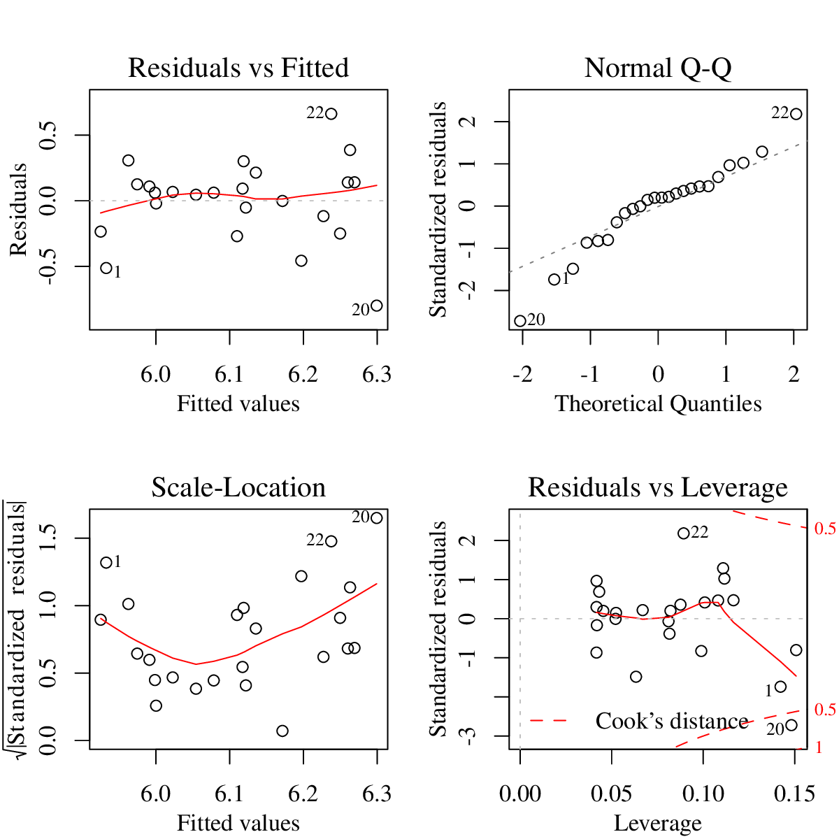
Figure 2: Diagnostic plots for linear regression.
Linear regression is one of the basic tools in data analysis. In its classical application, linear regression is used when the response variable and the predictor(s) are both numeric (interval or ratio scale) variables. However, as exemplified in Section 4.6, and as we will demonstrate further, many of the statistical analysis techniques can be cast as variations (or extensions) of linear regression. In this section we will revisit the correlation and regression with single predictor variable, and continue with the multiple regression and model selection. First, we will again prepare the data we will use.
The new data set we will use in this part contains geographical distance and aggregate pronunciation difference of 613 locations in the Netherlands. It has two variables, linguistic distance measured by average string edit distance of a set of words, and geographic distance in kilometers. The data is a subset of the Dutch date set analyzed by Nerbonne [2010]. Note that (to save myself from some difficult questions) the distances corresponding to the sites very close to each other are not included in the data set we will use here. The data can be found at http://coltekin.net/cagri/R/data/ling-_geo.rda.
We will also make use of the data set seg from Section 6, and the mlu data set from Section 3. If you do not have the data in your R environment, you should return to Exercise 6.1 and to the beginning of Section 3 to load or create these data sets.
We have introduced how to calculate some of the correlation coefficients earlier in Section 2.2. Here, we will revisit this, and introduce the way to make inferences regarding correlation. We will not dwell on the assumptions of correlation. The Pearson’s correlation coefficient shares all its assumption with least-squares regression with a single predictor, and we will check these assumptions in the next subsection.
Remember that all can be calculated using the same function cor().
The correlation coefficient calculated by cor() gives you the expected correlation in the population. However, it does not include any inferential information. The function cor.test() gives you the confidence interval and a hypothesis against with the null hypothesis ‘there is no correlation (the coefficient is equal to )’.
If you pass a data frame to cor(), it will return a matrix of all pairwise correlations between the variables in the data frame. This is handy if you have a large number of variables, and you’d like to inspect correlations between them.
TIP: In this exercise, we want to take a subset of 5 columns from a 7-column data frame. It is easier to exclude the remaining two columns instead of listing all 5 we need. In R a negative index value results in exclusion of the data point. For example, a index value of will exclude the first item, and likewise, a vector index of the form will exclude the first two items.
One thing to note in Exercise 7.4 is that one of the variables we have included in the correlation analysis (boundary) is not a numeric variable. Correlation coefficient between the numeric and categorical variables can be calculated using so-called Point-biserial correlation coefficient, which gives yet another hint that linear models can handle both numeric an categorical data types.
In Section 3, we already did some exercises with linear regression. In summary, we fit a linear model using lm(), and extract the information we need in most cases using summary(). We worked on these steps earlier in Listing 5 for predicting mother’s MLU from the child’s MLU (repeated here as Listing 9 for convenience).
You should already be able to interpret most of the information presented in Listing 9. If not, you are encouraged to revise Section 3.
Assuming the modeling assumptions are sound (we’ll check these shortly),
Here, we will first focus on model diagnostics, checking whether the least-regression assumptions hold or not. Previously we extract residuals and tried to check whether they are normally distributed or not. R provides an easier way of checking various assumptions of linear regression. All you need to do is to type plot(m) (assuming you saved your model as m). This produces four graphs presented in Figure 2.
All graphs in Figure 2 expose possible violations of modeling assumptions. The top-left graph, residuals vs. fitted gives an indication of whether your residuals are correlated or not (independent). What you do not want to see here is to have any sort of pattern. The graph at the bottom left, fitted vs. is basically the same graph with a different scale. It helps seeing some patterns that are difficult to see in the first graph. In both graphs, you could detect nonlinearities and if variance is not constant across the predicted values. For a regression analysis with single predictor, you can see these values from a simple scatter plot (you may need to tilt your head a bit to see the resemblance). However, as the number of predictors increase, scatter plots will not be as useful, but fitted vs. residuals graphs will still be a useful diagnostic.
In both graphs, although it is difficult to decide due to small number of data points, it seems variance decreases around the region that correspond to fitted values of to of the mother’s MLU. The fitted vs. graph also indicates some mild non-linearity. The cases that may be causing the problems are labeled (by their row numbers in the data frame). These graphs identify data points , and as potential causes of poor model fit.
The top-right graph is the familiar Q-Q plot. For least-squares regression, we want our residuals to be normally distributed. Again, it is difficult to judge due to small number of cases, but our example seems to diverge slightly from the ideal line in both tails.
The last, bottom-right graph gives an indication of influential data points. Leverage of a data point is the distance of a data point from an average data point on the x-axis (or on the multidimensional space defined by all predictors). The points that have high leverage and/or large residuals are likely to be very influential. Cook’s distance is a measure of influence of a particular data point. You can think of Cook’s distance as measuring the effect of removing a data point from the regression analysis. If resulting parameter estimates change drastically, the point will have larger Cook’s distance. The contour lines drawn (at Cook’s distance , and if you have such points) indicate influential data points. The points that appear outside the contour lines need particular attention. The data point is obviously the most influential case, and and may also needs some attention. Although opinions differ, a rough guideline is that a Cook’s distance above should be a cause of concern.
Once you are convinced that a particular observation is an outlier, you may want to remove it from the model fit. lm() and similar functions provide a handy notation to select or exclude certain observations. The argument subset may be used to specify the row index for data in use. Alternatively, you can specify the data option with already selected rows, e.g., data=mlu[c(1:19,21:24),], or simpler data=mlu[-20,].
Compare the change in coefficient estimates, and value with respect to the summary displayed in Listing 9.
If you were careful enough in Exercise 7.7, you should not be content with the assumptions of the model we fit in Exercise 7.5. When regression assumptions especially the linearity assumption, are violated, one of the ways to fix it is to transform the predictor or the response variable. Normally, inspecting your data is helpful in detecting non-linearities, and deciding for possibly useful transformations. Here, we will first do the transformation first, and then justify it.
The inference for the slope indicates a reliable relationship between the outcome variable and the predictor. In other words, if modeling assumptions are correct, and the t-test performed for the slope is statistically significant, we confirm that predictor has an affect on the response variable within the chosen level of significance. Besides this ‘hypothesis testing’ interpretation, a linear regression fit can also be used for predicting the outcome variable for new values of the predictor. Given a predictor value , and the coefficients and , the value of the outcome variable, , can simply be calculated using the formula
Note that this prediction does not include the uncertainty associated with the estimate.
In R, you can use predict() to calculate model predictions (and confidence) about unseen data points. For example, assuming the variable mlog contains the model that predict linguistic difference from the logarithm of the geographic distance (from Exercise 7.10), Listing 10 demonstrates the use of predict() function to obtain the predicted linguistic differences between sites whose distances are 10, 20, 50 and 100km, along with the lower and upper values of the 95% confidence interval for the estimated regression line.
Note that the newdata option of predict() requires a data frame where the predictor variable(s) are named the same as the original data frame used for fitting the model. This may seem unnecessary for simple regression, but it will be clear why a data frame is required when we work with multiple regression. If you do not provide the newdata option, predict will use the data used for fitting the model.
The option interval=’confidence’ in Listing 10 results in the confidence interval for the estimated regression line: the expected value of the response variable at a given predictor value. If you specify interval=’prediction’, instead, you will get an interval where 95% of the future observations are expected to fall. You should think about the former as your estimate of the mean in the population, and the latter as the expected range of individual observations. If the number of observations used for fitting the model is large, the former (the confidence interval of the estimated mean) will be tight. However, the latter (the individual values sampled from the population) is unlikely to be affected by the increased number of observations during the model fit. If you skip the interval option, predict() returns only the predicted values without any interval.
TIP: You can create a number of, e.g., 20, equally
spaced values that span the x axis by
seq(min(mlu$chi), max(mlu$chi), length.out=20),
and use it with predict to obtain the lower and upper
bounds of the confidence intervals.
Plot geo vs. predicted values from the linear model without log transformation (the model in Exercise 7.5) using a red solid line.
Plot geo vs. predicted values from the linear model with log transformation (the model in Exercise 7.10) using a blue dashed line.
Use sensible axis titles, and include an appropriate legend in the resulting figure.
For the sake of demonstration, draw the confidence bands as in Exercise 7.11 for the model predicting linguistic differences from the logarithm of geographic distances. While plotting the confidence bands, use newdata option of predict() to obtain 20 equally spaced points over the x axis.